| Date | Description of Changes |
| 2008-FEB-05 | Shortened the distance that the Lamed extends above the Kaf; the original drawing relied too heavily on a skewed photo published by the Associated Press. Added Grena 2007 & Seger 1983 to the "References" (formerly "Sources") section. Added "Zigzag Terminators" section near bottom. |
| 2007-NOV-11 | Initial publication. |
If you know how to install fonts on your computer, you can obtain a .TTF file from me or Kris Udd so that you can see the letters published in BASOR #344 (herein abbreviated even further to B344) side-by-side with mine in the Paleography table below. After you've installed the font, you should be able to see all 22 Paleo-Hebrew letters in this test line (or they'll appear as normal Latin letters if you don't):
tvrqc[psnmklyjzxhwdgba
Oy veh! Several variations exist when English writers discuss Hebrew letters. I don't like the convention used by academia (for one thing, names are supposed to be capitalized; my elementary-school English teachers would be very disappointed if I were to begin a name in lowercase), so here's how they're named in B344 side-by-side with my preference (most Internet browsers should be able to render the modern block Hebrew letters in the middle column):
| B344 English | Hebrew Letter | My Version |
||||
| 'alep | א | Alef | lamed | ל | Lamed | |
| bet | ב | Bet | mem | מ | Mem | |
| gimel | ג | Gimel | nun | נ | Nun | |
| dalet | ד | Dalet | samek | ס | Samek | |
| he | ה | Hey | `ayin | ע | Oyin | |
| waw | ו | Vau | pe | פ | Pay | |
| zayin | ז | Zayin | sade | צ | Tsade | |
| het | ח | Het | qop | ק | Quf | |
| tet | ט | Tet | res | ר | Resh | |
| yod | ט | Yod | sin | ש | Shin | |
| kap | כ | Kaf | taw | ת | Tau |
Greetings! Back in December, 2005, a month after the international announcement of the discovery of the Zayit Stone, I attended a lecture by Bruce Zuckerman here in the L.A. area. It's documented in my Royal blog (at Blogspot & Wordpress) so I won't re-review it here. A year later, the excavation team published their official analysis of the stone & its inscriptions in B344. Since I'm not a member of ASOR, I don't automatically receive a copy of this journal, but I had been meaning to stop by a local college library to read it. One thing led to another, & the year went by. As I was preparing for the annual conference of Biblical scholars being held this year in San Diego, I noticed that an entire 2-hour session was being devoted to it, so it reminded me that I should get B344, which I promptly did.
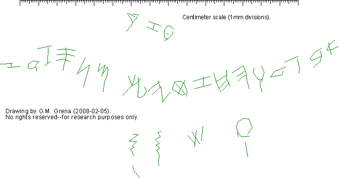
When I saw the entire abecedary at Dr. Zuckerman's lecture, the photo only remained on the overhead projection for about a minute. My initial reaction to seeing the inscription again, a year later in B344, was that the line drawing was way too fluid/smooth looking, & I felt it lacked detail. As I did with the controversial, unprovenanced Joash Tablet, I thought it would be fun to publish my opinion online, perchance someone else may enjoy hearing an alternate viewpoint. In this review, my primary intention is to provide a level of detail not available in the B344 drawing(s), & thereby assist the many people around the world who are interested in studying the implications of this inscription. My secondary intention is to offer some second-hand opinions as counter-points to views expressed in B344. Though B344 acknowledges Ada Yardeni for producing an "initial" drawing of it, & Zev Radovan for taking "preliminary" photos of it, I have no way of knowing who is primarily responsible for the drawings & photos I'm critiquing herein. I'm guessing that co-authors McCarter & Zuckerman produced the final version that went to press. I've met all 4 co-authors & admire their work, & forthright acknowledge that their firsthand examination of the stone & its inscription should take precedence over anything I'm presenting here. (Don't believe everything you read on the Internet [including this sentence].)
(This section would've contained thanks to B344's authors if they had made additional photos available.)
Though I'm grateful for the relatively prompt publication of this artifact by excavation-director Ron Tappy, I'm disappointed that he hasn't made photos available on his excavation website (www.zeitah.net) or any other public-access website. Also I'm disappointed by whoever is responsible for only publishing a single photo of each section of the inscription (Figs. 18, 20-4). Zev Radovan & Bruce Zuckerman obviously took more than 6 photos, & undoubtedly used alternate lighting angles to highlight various aspects of the letters; so even though I can understand there being a limited amount of space available in B344, I don't understand why alternate photos have not been made available elsewhere. With all due respect to Christopher A. Rollston, who has a 28-page article in B344, Was his 3-page introduction really necessary & of more value than additional stone photos would've been? Besides, his 3rd page is almost entirely blank, plus look at the space wasted at the end of p. 46. For shame! Prior to publishing these complaints, I sent an E-mail to all 4 co-authors asking if additional photos were available, & offering to visit them in person if copyright restrictions prohibited their being able to send them to me (the epigraphic photographers, Zuckerman & Lundberg who co-authored B344, are based here in southern California). I did not receive a reply. But I'm confident additional photos will be made available in the future, & I'll update this web page at that time.
By applying techniques I've developed over the past 5 years for photographing, drawing, & examining LMLK seals, I've observed some significant paleographical differences in the Zayit-Stone inscription when compared to that presented in B344. Whereas the B344 drawings appear like that written by someone with pencil on paper, my version recreates more closely the individual strokes/scratches that someone made on the stone medium. However, my findings have no significant impact on the overall conclusions published in B344.
Following my hunch that the B344 drawing didn't accurately represent what I saw at Dr. Zuckerman's lecture, I immediately made electronic copies of the overall inscription photo (Fig. 15) & both drawings of the abecedary (Figs. 17 [& 16, which is 17 overlaid on 15] & 19). The graphics editor I use allows me to import photos to different visual layers so they can be aligned & selectively turned on or off. It's very frustrating that none of these 3 figures were sized consistently. Those of you who have a copy of B344 can confirm this by measuring the distance from the middle of the Tsade on the left to the middle of the Alef on the right.
You may be thinking that all I needed to do was shrink Figs. 16 & 19 down to that of 17; but alas, 2 of the drawings are skewed! By measuring the overall height of the inscription (top of the Zayin to bottom of the Resh), & then dividing the width by the height, the ratios simply don't match.
Yikes! Skewed photos mean screwed researchers! If you don't have a ruler handy to confirm this, just look at the bottom stroke of the Zayin: In Fig. 16 the right half of it is smaller than the left half, but in Fig. 17 they're about equal, & the extra portion of the right side has a downward inclination. Figs. 17 & 19 are the same drawing, but Fig. 19 was probably skewed while adding the Gezer Calendar letters.
Another important red flag was the symmetrical representation of Het in these drawings. This letter appeared prominently in the 2005 press-conference photos published by Rodgers, Srakocic, & Wilford, available for everyone to see at the links I provided above in the References section. Compare what you see there to what you see in my drawing vs. B344's representation of it.
On p. 26: "The first fifteen letters in line 1 are clearly legible." Then a couple of sentences later, line one shows the 15th through 18th letters in brackets indicating that they are illegible. Letter #15 is the Samek.
Also on p. 26: In the space between the Kaf & Mem, "a large X, quite likely a graphic acknowledgment of the blunder." If the overall inscription is shallow, & the stone was prepared for it (as acknowledged elsewhere in B344), then why didn't the scribe simply erase it? Why the big X? Why not cross out the Lamed & continue farther to the left? (There was plenty of real estate on the stone ... or were other inscriptions already there? ... & were they later partially erased by someone else?)
Also on p. 26: "Ps 10:6-8; Prov 31:25-26 [LXX]" I think the LXX reference should be for Psalm 10 instead of Proverbs 31.
Footnote 42 on p. 26 of B344 mentions "the shallowness of the incisions" & "the numerous collateral problems that afflict the face of the stone as a whole--accidental scratching & gouging, incrustation by mineral deposition, deliberate abrasion for surface preparation & modification for secondary use, etc." I'm well aware of the trickiness involved when attempting to read inscriptions on ancient artifacts. In my own arena of expertise, I composed a web page showing examples of illusions & obstacles on LMLK seals. These in particular apply to the Zayit Stone:
For those who don't have hi-res photos of the stone to examine, I decided to include all the major marks I observed in B344's photos. In my detailed drawing below, lines that obviously belong to the main inscriptions are colored green, but other marks that may or may not be intentional inscriptions are colored blue.
Note that you can see a higher-resolution version of this on a separate web page (click here), & please feel free to make/distribute copies for additional research & commentaries.
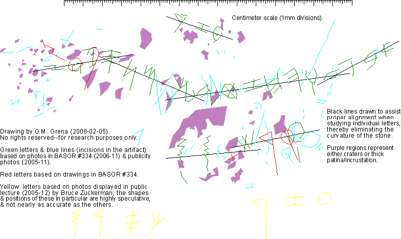
Dr. Zuckerman began his lecture on a somewhat humorous note, stating that everything he was about to share with us was "almost certainly wrong". If my lecture notes are correct, the 2nd OZR inscription at the bottom is in the approximately correct location, but the KC ("throne/bowl") inscription is actually on the top side of the stone. Where exactly? Sorry, I did not have time to describe it in my notes--I was too mezmerized by the photos he showed to us, & his shocking announcement of there being other inscriptions, & assumed it would be published along with the abecedary. All the yellow letters & zigzags (according to my lecture notes, there are at least 2 other pairs of zigzags on the stone) are mere copies from other letters in the abecedary--the real letters (if they're actually letters) almost certainly look different! In other words, what you see in yellow on my drawing is almost certainly wrong ... but something is definitely there!
For whatever reasons, the abecedary portion of the stone was not written in a single, straight horizontal line, so when studying the paleography of the individual letters, one has to determine which way to orient them for comparison to other specimens. In chapter 4 of the first book devoted to LMLK seals ("Die Konigs-Stempel"; Otto Harrassowitz, Wiesbaden 1969; pp. 105-14), Peter Welten described the "Schriftbild" (typeface) as having been written either "between 2 imaginary lines" (for the x4C seals) or "over an imaginary line" (for all the other LMLK seals; English translation of Welten's German book courtesy of Y. Aharoni in IEJ vol. 20 #3-4, 1970, p. 240; I regret not being fluent in German so that I cannot provide a fresh, detailed review of Welten's interesting idea). The black lines in the detailed drawing above represent my guess as to how the ancient writer was oriented as he/she wrote on the stone. I then rotated the letters per these imaginary-line groups for the analysis below.
| Red Comments by B344 | Udd Font (via B344) | Letters Drawn by G.M. Grena | Blue Comments by G.M. GRENA |
| The downstroke or stem ... is elongated ... This intermediate position between the Phoenician parent script and the script of other specimens of the South Canaanite tradition is an indicator of the high relative antiquity of the Tel Zayit Abecedary within the latter tradition. (f/n 52--The roundness of the head ... is uncertain because of wear on the surface of the stone...) | a |  |
My drawing has no impact on B344's analysis, but mine differs in that I show 4 distinct straight-line strokes comprising the body, whereas B344's rendering is smooth/curvy, which in this case they admit is "uncertain". |
| ...the head ... is rounded and larger than the usually triangular bet of the contemporary Phoenician parent script... (f/n 53--The triangular-headed bet is also the regular form in the 11th-century arrowheads...) | b | 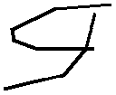 |
Again, no impact; one significant difference in my drawing is that the top stroke extends to the right of the vertical stroke; so too with the middle horizontal stroke; & again, my drawing portrays 5 distinct strokes comprising the body, & 3 comprising the tail, whereas B344's is smooth/curvy all over. |
| ...lacks counterclockwise rotation that characterizes its subsequent development ... an extremely archaic appearance... | g | 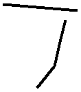 |
Here's the first instance where my Welten-lines make a difference; this rendition of Gimel not only lacks the counterclockwise rotation, it seems to actually be rotated significantly clockwise relative to the Bet & Dalet; also note that my version shows no connection between the 2 strokes, & a curious bend in the downward stroke reminiscent of early Aramaic such as the Saqqara papyrus (B344's drawing has the same bend, but mine is more exaggerated). |
| ...similarly compressed forms occur in formal and cursive inscriptions from many periods and many script traditions... | d | 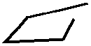 |
Two of my Welten-lines converge over Dalet, & I chose the left version because of the similarity between this orientation & the Bet. Unlike B344's version, my bottom-right corner doesn't have a right angle. |
| ...produced according to the common pattern of the early first millennium B.C.E.... | h | 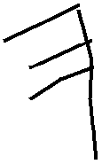 |
My long vertical stroke differs slightly from B344, in that mine becomes more vertical below the connection with the lowest horizontal stroke; also my vertical stroke does not actually connect with the top horizontal, & my middle horizontal extends to the right of the vertical--in other words, my drawing shows a level of detail not present in B344's, but again, it has no impact on B344's analysis. As you can see in my detailed drawing, the long blue line intersecting the Hey's vertical stroke gives it an appearance resembling a Yod; however, it does not actually connect to the Hey's lowest point; furthermore, it extends over 4x the distance we would expect a Yod stroke to cover. This tremendous length isn't shown in the cropped photos presented at the 2005 press conference, thereby causing some people to think this Hey was drawn as an anomalous, out-of-sequence Yod. |
| ...an extraordinary form ... strikingly archaic... | w | 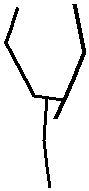 |
My drawing shows the upper half as 5 distinct strokes, with the bottom-right extending below the middle connection (a sort of signature-characteristic that recurs in other letters discussed below). My rendition also shows a curvature or bentness to the lower vertical stroke, but overall, mine has no impact on B344's analysis. |
| ...large, very broad, and symmetrical ... no hint, however, of the cursive tick descending from the right edge of the horizontals that developed in later Hebrew script... | z | 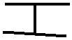 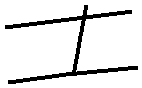 |
Here you can see both Zayins, the top one from the OZR inscription, & the bottom from the abecedary. Per my Welten-lines, the angles differ slightly, but have no impact on B344's analysis, though my lower Zayin is less symmetrical than the upper one & the B344 drawing, plus my vertical stroke extends a little more than shown in the B344 one. |
| (f/n 56--...crossed by an extraneous stroke [secondary damage to the stone] that gives an exaggerated impression of the obliqueness of the sign...) | x | 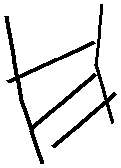 |
My drawing differs a bit in construction from the idealistic symmetrical design drawn in B344 (probably due to the influence of the secondary damage, which makes it difficult for me to determine which strokes belong to the letter); however, B344's analysis focuses on the overall obliqueness of the form (in contrast to the more-typical square form) & 2- vs. 3-bar versions, so my admittedly unusual rendition has no impact. |
| ...large and ovoid. In both these respects, it is reminiscent of the 12th-century `Izbet Sartah form, though the resemblance may be coincidental. ... On the other hand, the tet in line 5 of Arad Ostracon 76, probably dating to the ninth century, is also ovoid in shape... | j | 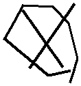 |
Again, no conflict between theirs & mine, though with mine you can see 7 strokes comprising the ovoid polygon, which doesn't close completely--you can see how the bottom strokes misalign (as in the Vau); note that one of my center cross-strokes crosses over both ovoid borders, whereas B344's cross-strokes remain inside. |
| ...large and broad ... Both ascending and descending tails persist ... until the late seventh century... | y | 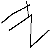 |
My drawing is even more broad, & shows a distinct construction of the 2 top strokes from the 3 bottom strokes. This construction struck me as odd, since looking at the B344 drawing (which shows a typical Yod) gives the appearance that the main vertical stroke is continuous. Note that the bottom-right "ascending tail" & the lower half of the bottom vertical stroke are somewhat speculative since this region of the stone contains a crater, but the crater's border probably preserves the original Yod strokes. |
| ...fits well into the transition from the Phoenician parent script of the tenth century to the independent Hebrew national script. ... the body stroke ... is drawn about 45 [degrees] from the vertical--approximately the angle preferred for kap in the mature Hebrew script. | k | 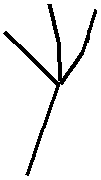 |
Our drawings are nearly identical, with the only exception being that my top-right stroke is slightly longer; however, B344's discussion of the angle is highly contingent upon one's view of the letter relative to the adjacent Lamed with which it overlaps. It seems to me that the scribe might have originally drawn the Kaf lower (traces of it appear in blue lines in my detailed drawing), then decided to draw it higher (or vice versa--who knows?). In any event, per my Welten-lines, the angle of the descending stroke is 70 degrees! (Note that Kris Udd oriented the Kaf in his font identical to mine, though he made his months ago, & I did not see his font until after I had made my drawing.) (By the way, am I the only person who got hungry when reading the B344 phrase, "Hebrew national"?) |
| The descending main stroke ... is very short, and the hook is broadly and tightly curled. These traits give the letter a strikingly archaic appearance reminiscent of the lamed of the 11th-century arrowhead scripts--indeed, of the earlier part of that series. The standard lamed of the Phoenician parent script, as seen in the tenth-century Byblian series, is drawn with a long, straight stroke that descends to the left and then curls sharply up and to the right, forming a rather small hook. This hook is sometimes drawn as a tight curve and sometimes as an oblique angle, with the latter form giving the lamed a "check-mark" appearance. In sharp contrast to the archaic, broadly curled Tel Zayit form, the Gezer Calendar lamed adopted the check-mark lamed of the Byblian corpus, a form that persists in the developing Hebrew script to the end of the tenth century and beyond... | l | 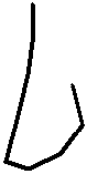 |
The significant difference between my drawing & B344's is the descending main stroke. They chose to draw it only below the adjacent Kaf, but my rendition seems plainly visible in Fig. 22, though the Kaf intersects it. Of course, there's a chance that what I perceive to be the top stroke of the Lamed is actually an illusion created by speckles or patina, but only additional photos with alternate lighting could persuade me. This extension is not visible in the brightly illuminated Fig. 21, but I could point to strokes of other letters masked by its strong lighting (e.g., the left branch of the Kaf, the top-left & top-right cross-strokes in the Tet, the bottom-left corner of the Het, & 2 middle-segments of the zigzag terminator; note that I have a particular interest in Lameds since they play a prominent role in LmLk seals, which contain both the checkmark & tight-curl hooks). |
| ...a surprisingly advanced appearance ... drawn with a head that clearly appears to be typologically advanced beyond the Gezer mem and even the cursive Arad mem. ... In one important respect, however, the form of the Tel Zayit mem maintains its archaic character: it preserves the straight, uncurved form of the descending stem or tail. There is no hint of the tendency ... for the lengthening shaft of the stem to bend from right to left and then to curl upward at the end, in the manner diagnostic of later Hebrew mem [sic]. | m | 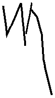 |
My drawing is nearly identical to B344's, though with an additional level of detail featuring the descending stroke's elegant curvature (distinct from the terminating curve described in B344). Again, my Welten-line factors into the counter-clockwise rotation of this long stroke, which makes it resemble similarly prominent strokes in the Hey, Het, Nun, & Samek. |
| The head ... is large and tightly coiled, giving it an appearance that, in contrast to the head of the mem, is quite archaic. It is even closer in this respect to the eleventh-century arrowheads than to the tenth-century Byblian sequence. | n | 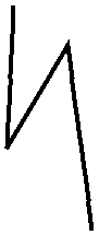 |
Apart from my admittedly unusual rotation, my drawing resembles B344's. Before anyone can argue against my rotation, they'll have to explain why the scribe could not possibly have intended to write it this way, and why they would not rotate letters on the right side of the abecedary (especially the Gimel, Dalet, & Vau), which would look equally unusual if one were to rotate them counter-clockwise from their typical positions to compensate for someone reading the abecedary from a fixed, central position. |
| ...parts of the sign, especially at the upper left, are obscured by surface incrustation on the stone. ... There is no hint of the cursive tick descending from the right edge of the three horizontals... | s | 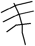 |
There is a stroke colored blue in my detailed drawing descending from the right side of the middle branch, but it's probably incidental to the stone, & wasn't written during the construction of the Samek. One clear distinction between my drawing vs. B344's is that my bottom branch contains a sharp downward bend. The other 2 branches above it also bend, but because they do it right at the intersection with the main descending stroke, it's obscured (place a straight-edge against your computer screen on each of the ends to see for yourself). Only the middle stroke of B344's drawing is bent; the top & bottom ones are drawn relatively straight. |
| ...`ayin is ovoid, thus paralleling in this respect the shape of tet. This departure from the more familiar circular shape ... may have been a consequence of the hardness of the limestone or, alternatively, of the influence of a cursive tradition. | [ |   |
The OZR-inscription Oyin (not drawn or commented on in B344) is a bit easier to see in Fig. 18 than the abecedary's Oyin in Fig. 23. Notice how similar their constructions are to the Tet (also the Vau) with the same misalignment between the connecting strokes at the bottom. And I freely admit that the archaic-looking dot in the center of the pictographic eye-shape is probably an illusion caused by either a patina shadow, or a small crater--I just couldn't resist including it to have a little fun--but it's there in the only photo at my disposal, so it would be unscientific of me not to draw it! |
| The interpretation of the end of line 1 is complicated by incrustation and abrasion of that part of the stone. ... Pe is large, and the head is broad or open ... curled... | p | 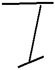 |
I see something totally different than what B344 does; our main descending stokes don't align at all. I'm not nearly as confident in the bottom horizontal stroke as I am in the top horizontal, because it could be a patina shadow, but the top one seems obvious & is definitely not curled. I think that what B344 perceives as a curl is a patina shadow in Fig. 23, but the straight incision I've drawn is clear in both photos. The only question is whether this straight stroke was drawn by the writer as the top of the Pay, or simply a stray mark that has nothing to do with the abecedary. Assuming that this bottom stroke represents only my imagination, notice how the 2 large strokes are nearly identical to my Gimel (including rotation). |
| ...a flattened shape that anticipates the later development of the Hebrew form of the letter. ... the obliquely drawn base stroke is anomalous (f/n 61--There are numerous examples in various Hebrew inscriptions of both vertical and ascending base strokes, but not descending base strokes.), though it seems indicated by close examination of the best photographs and of the stone itself. | c |  |
My Welten-line rotation produces the same descending base stroke, but whereas B344 draws the top stroke horizontal, my top stroke contains the same inclination as the bottom one. |
| ...large ... symmetrical, two-chambered design that anticipates the subsequent history of the form. ... the two chambers of the head, though symmetrical, are drawn separately. ... not a simple oval but is tapered at the bottom where it joins the stem, giving it an appearance that is distinctive if not unique. | q |  |
I do not see any evidence at all for the vertical line to continue up through the oval, which, like the Tet & Oyins, reveals the same inability (or reluctance) of the scribe to connect the bottom-right strokes. I do, however see something resembling a cross-out "X" going through the oval (which I decided to keep on the blue layer), though this may be a phantom due to speckles or natural surface shadows. Also note the curious resemblance to a modern "Q" I drew in blue below & to the left of what I perceive to be the real Quf. There's a chance this could be a phantom caused by the thick patina covering this lower region of the stone. I should also point out that the location of my Quf differs significantly from that in the B344 drawing. The clear Shin provides an accurate anchor, but their Quf is to the left of the one I see in Fig. 24. |
| ...difficult to identify ... the surface of the stone is somewhat abraded at this point, and the area is intruded upon by a combination of extraneous gouges and geological incrustations. | r | 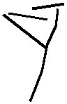 |
I see no evidence whatsoever for the Resh as drawn in B344. My Resh, shown here, is from the relatively clear specimen in the OZR inscription. This time, the scribe appears to have had difficulty connecting the 2 top strokes. The slight wiggle/curvature to the long descending stroke vaguely resembles that of the Mem. |
| ...strikingly large ... and this large size seems to be characteristic of the sin of the inland script of southern Canaan in the tenth century in contrast to the Phoenician prototype. ... rather coarsely executed by the scribe ... characterized by casually drawn, overlapping strokes. | v | 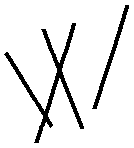 |
Though 3 of the 4 strokes produce 2 significant overlaps, my rendition of the 2 rightmost strokes do not overlap. In fact, this far-right stroke more closely resembles an elongated crater than one of the other 3 strokes, each of which is a very narrow trench. There's a chance that this right stroke is illusory--a figment of our paleographical imaginations. |
| ...a +-type taw retained from the Phoenician parent script ...In the subsequent development of the inland script, this +-type taw was replaced by the x-type, which became the standard form of the fully developed Hebrew script... | t | ? | I see 2 small scratches that I colored blue that vaguely resemble a Tau, but I believe they're too small & positioned too low to have been an intentional Tau. The identification of a letter here is exceptionally unlikely due to the fact that a large portion of the region between the Shin & the zigzags appears to be a crater! But even if the crater is illusory & a Tau as drawn in B344 is there (shown in red on my detailed drawing), I'd have to question the rotation of the symbol--if attempting to accommodate the angle of the Shin, it would be a +-type; if attempting to accommodate the zigzags, it would be halfway between the +- & x-types (as represented in the Udd font). |
Page 40 of B344 includes a paragraph discussing the 2 "irregular zigzag strokes" that appear after the final letter of the alphabet. As noted above, traces of similar pairs appear elsewhere on the stone. Though there are no known parallels from other inscriptions (as noted in B344), two similar zigzags appear on jar "G72 IV.5.162 #1" excavated from Gezer in 1972 (see Seger plate III #11-12) identified unhesitatingly as a pair of Mems. Whereas the abecedary's symbols seem to morph from zigzags at the top into straighter lines at the bottom (which is what we would expect based on the Gezer Calendar Mems), the Gezer jar pair are strictly zigzags. And though B344 describes the abecedary's zigzags as consisting of "six or seven" strokes, my version consists of 9 or 10 (depending on whether you include the long stroke at the bottom. Both zigzags on the Gezer jar consist of 11 strokes (note, however, that this count is based upon a drawing, not a photo). Two other jars, "G72 IV.5.48 #1" & "G72 IV.5.70, 63-65 #1" contain single 8-stroke zigzags identified as Mems. Finally, note that although the Gezer marks appear without an inscription, they were published in the context of stratified jars, being "the earliest group of securely dated, Proto-Canaanite letter[sign]s" (Seger p. 478).
One thing the Zayit Abecedary 'teaches' us: If there were Iron Age Phoenician/Canaanite/Paleo-Hebrew scribal schools, they were not very strict with their students! For example:
That's about as diverse as one could expect! Were it not found in-situ stratigraphically, its age would be anyone's guess, spanning no less than FIVE (5) centuries (i.e., half a millennium)--assuming it to be legitimate rather than a poor fake by someone unacquainted with what hypothetical scribal schools should produce.
This comes as no surprise to anyone familiar with LMLK seals, where in less than half a century (the consensus of real scholars still believes it to be only a few years), we see another paleographical potpourri representing at least 2 centuries' worth of styles! This, to me, indicates nothing other than there having been a tremendously wide variety of writings & writers during the 1st & 2nd millennia BC in the land of Israel. None of the writers have survived, & only a few of their writings have--those on non-perishable materials such as pottery & stones like this one.